Tampilkan postingan dengan label Khusus Desain Grafis. Tampilkan semua postingan

Membuat Design Almamater dengan Corel X3

Salam sejahtera buat kita semua ..ketemu lagi dengan saya,.
saya akan mencoba untuk menjelaskan tentang cara membuat design almamater dalam coreldraw X3
Ok .. bagi yang berminat langsung ikuti langkah – langkahnya di bawah ini :

Langkah 1
Buat lah sebuah rangka untuk lengan almamater , anda dapat menggunakan
Bezier Tool kurang lebih anda membuat design rangka lengannya seperti ini
Untuk langan kirinya anda dapat mengcopy langan yang telah di buat sebelumnya tadi, dengan cara “ klik kanan tahan pada object – pindahkan – klik kiri dan lepad “

Langkah 2
Di langkah ke dua ini anda membuat rangka body pada almamater, cara yg di gunakan sma seperti langkah 1, yaitu anda dapat menggunakan ‘ Bizier tool ‘ buatlah rangka bodynya kurang lebih seperti contoh di bawah ini
Untuk rangka body kirinya anda dapat mengcopy langan yang telah di buat sebelumnya tadi, dengan cara “ klik kanan tahan pada object – pindahkan – klik kiri dan lepad “

Langkah 3
Di langkah ini anda dapat menambahkan garis panjang di bawah kerah dan sedikit tambahan di bawah rangka body yang sebelumnya telah kita buat tadi
hingga hasilnya jadi seperti di bawah ini “yang bewarna hitam“
Jangan lupa untuk menambahkan juga sebuah grafic kancing yang akan Qita taruh di ujung rangka body seperti di atas. Untuk membuatnya anda dapat menggunakan
ada di sebelah kiri papan menu corel anda.
Da Untuk membuat rangkanya seperti di atas cara yang di gunakan sama seperti langkah 2, “tambahan agar hasil garis pada rangka yang telah Qita buat lebih terlihat nyata anda dapat mengaturnya dengan menggunakan “ Shap Tool ” .

Langkah 4
Sekarang buatlah tambahan 3 buah kancing dan garis batas pada ujung lengan..
Untuk membuat kancing, caranya sama seperti sebelumnya anda membuat kancing di langkah 3 . dan untuk membuat garis batas anda dapat menggunakan ‘Free Hand Tool’ seperti ini
, higga hasilnya tampak seperti di bawah ini :
Dan untuk sebelah kirinya anda dapat mengcopasnya langsung, caranya ikuti seperti keterangan pada langkah 2 di atas.

Langkah 5
Nah... di langkah 5 ini tugas anda sudah sedikit lebih ringan , disini anda tiggal membuat kerah yang akan kita gunakan untuk almamater yang kita buat.
Untuk membuatnya anda dapat menggunakan ‘ Bizier Tool ‘ atau
‘ Free Hand Tool ‘ dan setelah itu edit sedikit pada garis yang anda buat dengan menggunakan “ Shap Tool ” . bentuklah garis yang andabuat menjadi setengah lingkaran.
Kurang lebih Y seperti dibawah ini jadinya “yang warna hitam”
NEXT...

Langkah 6
Buatlah tambahan grafis yang akan nantinya kita letak di atas pundak dari almamater yang telah kita design..
Untuk membuatnya sama dengan saat anda membuat tambahan dibawah rangka body, seperti lagkah 3 di atas, dan jangan lupa tambahkan dua buah kancing di dalamnya .
` hingga hasilnya dapat anda lihat seperti dibawah ini “yang berwarna hitam”


Langkah 7
Setelah semuaya selesai sekarang anda dapat memberinya warna, degan sesuai kebutuhan
Untuk memberinya warna anda dapat menggunakan papan menu yang ada di
sebelah kanan corel anda sebelumnya jangan lupa untuk menyeleksi terlbih dahulu object yang akan anda beri warna nantinya..
Dan endingnya tergantung kreatifitas anda masing – masing lagi ..

Hasil Akhir

Good Luck Brother and sister ..

Teks Efek Shingeki No Kyojin

Teks Efek Shingeki No Kyojin

Hai, pembaca setia Sharing Online, saya kembali hadir dengan membawakan tutorial seputar Adobe Photoshop, Sekilas belajar dari sahabat saya, dan juga bimbingan para ahli designer. Oke Langsung Aja Pertama Siapin Alat Tempur :

Background = Background
Saya Menggunakan Font Bebas Neue, Namun di Tutor Ini Pake DIN Black, Tapi Juga Boleh Untuk Searching Lagi
Font untuk Tulisan Kecilnya Saya Menggunakan Deadline Tapi Seperti Tadi Bisa Dengan Yang Lain
Nah Ini Salah Satu Hal Paling Penting : Brush

Lengkap Kan? 
Langsung Action!

1.Buat Dokumen Baru Dengan Ukuran 1366 x 768 px Atau Terserah...

2. Buat Teks Apaan Gitu, Contoh 'Vectoar' Atau 'MC-LIVE'


[Image: 2.png]


3. Terus 'CROOT'-in Dah Tuh Brush, Bahan Refrensi Nih Lihat Spoiler

[Image: 5.png]


4. Buat Brush seperti ini, Ctrl + T, Terus gepengin , Buat 3 Dan Susun Diatas, Dan Dibawah Teks :

[Image: 6.png]


[Image: 7.png]


[Image: 8.png]


5. Terus Di Merge Layers Semuanya Selain Background Ya

[Image: 10.png]


6. Lalu Klik Kanan Layer Nya Terus Layers Style, Terus Gradient Overlay Dicentang, OK

[Image: 10.png]


7. Kita Bikin Efek Darah, Pakai Brush Lagi, Terus Nanti Diwarnain Merah Tua Gitu

[Image: 11.png]


[Image: 12.png]


8. Lalu Disesuaikan Darahnya Dengan Teks Seperti Ini :

[Image: 13.png]


9. Seleksi Teks Tadi Dengan Ctrl+Klik Layer Teks Nya Tadi Dan Inverse(Ctrl+Shift+Click)

[Image: 14.png]


10. Hapus Bagian Yang keluar Dari Kata 'vectoar' Tadi, TErus Bikin Brush Kayak Lingkaran Item Tadi Tapi Orange :

[Image: 18.png]


11. Disusun Dibawah Kata Kata Semuanya Tadi, Dikasih Efek Outer Glow Juga :

[Image: 20.png]


12. Terus Masukkin Background Dan Taruh Paling Bawah diantara Layer Layer Tadi tapi diatas Background Yang Lock

[Image: 22.png]


13. Terus Kasih Tulisan Apaan Gitu Di Orange Orange Tadi

[Image: 23.png]


Jadi Deh Tinggal Save As! 

Itu Tadi semua Punya Sumber

Contoh, Seperi Ini


[Image: 1391973_652222414830403_1412426971_n.jpg]
Fantasy Art Photopshop Tutorial – Plasma in the Lake

Fantasy Art Photopshop Tutorial – Plasma in the Lake

 This tutorial was originally posted on loreleiweb.com but due to technical reasons moved to pswish.com. The tutorial remains a copyright property of Lorele

The requests for Fantasy Art tutorials are enormous, I still get emails and Pms from people asking to do more Fantasy Art tuts, so here is one more, called “Plasma” (Star, not the TV!) which I hope you’d enjoy.


1. Make a new canvas, we used 600*480 px here, but the size is of course optional.


2. Select the Gradient Tool, using two shades of blue (see below), fill your canvas, so that the darker colour will be on top.


http://loreleiwebdesign.com/wp-content/uploads/HLIC/eda9bf1fac802b517e57524bf45c3022.jpg


3. Take a photo of a girl. Traditionally I am using Arman‘s photo from her Deviant Art account, but you can replace her with any semi-sitting figure of your choice. Crop the figure and paste her unto your canvas. In needed, resize her so that she will fit in.


4. To get rid of the visible crappy cropping, and to give the girl more emphasis, add blueish glow to her by going to Layer >> Layer Styles >> Outer Glow and applying the following settings:

http://loreleiwebdesign.com/wp-content/uploads/HLIC/b135eb0e83de1c64e0ac69c6f84a3a6f.jpg
This is what you would get:


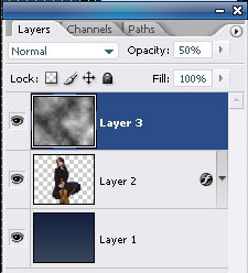
5. Make a new Layer. Make sure your primarily and secondary colours are black and white. Go to Filter >> Render >> Clouds
 
http://loreleiwebdesign.com/wp-content/uploads/HLIC/d484e43dafea5cd402d994600312c5cb.jpg

And, if needed apply the clouds effect a several times to achieve the desired randomly “clouded” effect.


6. Reduce the opacity of the layer to semi-visible.

http://loreleiwebdesign.com/wp-content/uploads/HLIC/d5de0439e09da49491ecffc8890eb01d.jpg

7. Press Ctrl+T for free transform, and then right mouse click and “Scew”. Drag the left corner of the clouds layer, as shown on the illustration below:


Press “Enter” when you are done, then Ctrl + D to deselect the layer.

8. Duplicate the clouds layer. Select the upper layer and go to Edit >> Transform >> Flip Horizontal.


9. Select the girl’s layer from layers panel and drag it to the top, so that it would be your utmost upper layer.


Remember to remove the parts where layers turn to be on top of one another.

10. Take a photo of a lake with water circles. We used this one from Digital Free Photo, but again – this is optional.

Paste the layer unto your composition, so that the circles in the water will be “around” the girls or your main figure.


11. Using the Eraser Tool, remove the lower part of the girl’s layer, so create the illusion as if she is really sitting inside the water and the water circles are “from” her.


12. Set lake’s layer blending options to Luminosity.


13. Drag the Layers of the clouds on top of the water later and using eraser tool with soft edge (100px) remove the sharp parts, so that only the “steaming” clouds will remain, no edges.


14. Now to the hard bit – creating the plasma cycles.

Make a new layer (this is important) and place it on top of all the others.

15 Using the Elliptical Marquee tool, draw and ellipse. While the ellipse on the new layer is selected, Right-mouse-click and choose “stroke”. Apply the settlings below for the stroke effect:


16. Press Ctrl + T to free transform, and then right-mouse-click >> Prospective. Try to distort the round layer you have to it would look like the line is surrounding or flowing around the girl.

http://loreleiwebdesign.com/wp-content/uploads/HLIC/94c651aa8cbab5cafc511c65f08b9b89.jpg

17. Using the Eraser tool with big soft edge, remove the “farther” part of the round, behind her head, like this:


18. While this layer is selected, go to Layer >> Layer styles >> Outter glow and apply the following glow settlings:


http://loreleiwebdesign.com/wp-content/uploads/HLIC/5ccb93943e152d64bae67a3ac413be53.jpg

19. Duplicate the layer a several times and each time transform the round using the prospective settlings, so that the circles chaotically surround the main figure’s body.

http://loreleiwebdesign.com/wp-content/uploads/HLIC/4f1719304fa2facec5b724154f5f26d9.jpg

20. Remember to leave the “front” part of the circle visible and erase the “back” part of it. This is more or less what you should have by now:

http://loreleiwebdesign.com/wp-content/uploads/HLIC/6f7804b7e1f3030de5aa8b2ac7e508fa.jpg

21. Flatten the Layer.

22. Go to Image >> Adjustments >> Levels and apply the following settlings to give the image an overall bluish hue:

http://loreleiwebdesign.com/wp-content/uploads/HLIC/ce7dca14b19a189341d7bccc221e9a73.jpg
http://loreleiwebdesign.com/wp-content/uploads/HLIC/9eab6f697ab4ee216b3432bb7d09a926.jpg

23. Duplicate the layer.

24. While the upper layer is selected (and your background colour in the palette is set to white), go to Filter >> Distort >> Diffuse Glow and apply these glow settings.


25. Reduce the opacity of the “glowing layer” to 20% (or less, depends on your image).

26. Flatten the layer again to merge both layers into one.

27. Using some star brushes (download free on deviant Art resources page), apply the stars chaotically around and allover the glowing cycles.


28. Select the background layer (the artwork, not the stars) and to to Renters >> Lightening effect, apply the following spot light effect twice.


29. Get back to Stars layer, and go to Layer >> Layer Styles >> Outer Glow, and add the following glow using white #ffffff colour.


30. Duplicate the stars layer.

31. Go to Filter >> Blur >> Radial Blur and apply these settings.


You may choose to reduce the opacity of this layer if you feel the rounded blurred effect is too strong. That’s it, your artwork is ready:


Download my poorly cropped Render: