| Teks Efek Shingeki No Kyojin
Hai, pembaca setia Sharing Online, saya kembali hadir dengan membawakan tutorial seputar Adobe Photoshop, Sekilas belajar dari sahabat saya, dan juga bimbingan para ahli designer. Oke Langsung Aja Pertama Siapin Alat Tempur :
Background = Background
Saya Menggunakan Font Bebas Neue, Namun di Tutor Ini Pake DIN Black, Tapi Juga Boleh Untuk Searching Lagi Font untuk Tulisan Kecilnya Saya Menggunakan Deadline Tapi Seperti Tadi Bisa Dengan Yang Lain Nah Ini Salah Satu Hal Paling Penting : Brush Lengkap Kan? 1.Buat Dokumen Baru Dengan Ukuran 1366 x 768 px Atau Terserah... 2. Buat Teks Apaan Gitu, Contoh 'Vectoar' Atau 'MC-LIVE' ![[Image: 2.png]](https://blogger.googleusercontent.com/img/b/R29vZ2xl/AVvXsEjrp6rmVGFNYyDwfvlvGKe46OaDplapbIDYEANxH6rtjzOYt0geiIQ8PtrYd5V-r3q6YOz1MjHeYazPW1MGUWx1yWrSX8YBBBoyj0dQoAdxVjl_yk0FbfWHc6TeTp-teJMeO5Cf22x0ZZHR/s1600/2.png) 3. Terus 'CROOT'-in Dah Tuh Brush, Bahan Refrensi Nih Lihat Spoiler ![[Image: 5.png]](https://blogger.googleusercontent.com/img/b/R29vZ2xl/AVvXsEiRrmftNC3_kwdqldlqMewoSuT6qHUz4fCMm4UZUaDxgg0NSxEreyC70uhABaNT53aijj6pxzj2LZ1VA6Zj11zWky6AHFsi6xrHCIgfOnkkm_QwZdagAbofnG00sTQCaBfdti31pRbYb78d/s1600/5.png) 4. Buat Brush seperti ini, Ctrl + T, Terus gepengin , Buat 3 Dan Susun Diatas, Dan Dibawah Teks : ![[Image: 6.png]](https://blogger.googleusercontent.com/img/b/R29vZ2xl/AVvXsEgxNYW8YX9cncPsN1qN42f11oGDQSyJIglEUg2CjC9v0UoZgPhHkr-6v-mxIZ07qAmfXY1NXph27007LnmddudhsaUEwDvXdgGK3_iulovbehpLdijx5OueqAUFSaT8Iy8fCp8fxZ16QLhU/s1600/6.png) ![[Image: 7.png]](https://blogger.googleusercontent.com/img/b/R29vZ2xl/AVvXsEjrWL_aIdh5VttnkZFUVDPrzyvwFZbtcV_J6rryGNVllDYiOSwOOHWoMAbP-PXS0QO5-Slcm2aBUQDAQ7SGTHCCCq_VCDICMIrraveehZhlxuJvUKNzDtsjPCan4ZJmP8kJS0l2RimCv4NN/s1600/7.png) ![[Image: 8.png]](https://blogger.googleusercontent.com/img/b/R29vZ2xl/AVvXsEjNVTQ0Z41KDZ4u04GT4JztzwznPXM0ADvSjAVCiMeYeA5TWr9nEaO66dVZ4PIwsNNapxUb2gRC8MiC1v3YKKfXTFL_FvCWlFffRFfJVkMdTUEEeNTCHgEmgFhA7AtwnT9m74WDQtqWBF5F/s1600/8.png) 5. Terus Di Merge Layers Semuanya Selain Background Ya ![[Image: 10.png]](https://blogger.googleusercontent.com/img/b/R29vZ2xl/AVvXsEh3MEpyJvZNbE0PySKTAdXKbbozSGVP6H6kf5cJWmkJ451f5vUZ3RQAQC9TArQ1qTWyqVt0FC_m6Ru2pRygVcbBOWbXkxjCgqlMPDGF0CzkypSQe8KpWyFei3zLF967PJwBfEZzgomAhPa4/s1600/10.png) 6. Lalu Klik Kanan Layer Nya Terus Layers Style, Terus Gradient Overlay Dicentang, OK 7. Kita Bikin Efek Darah, Pakai Brush Lagi, Terus Nanti Diwarnain Merah Tua Gitu ![[Image: 11.png]](https://blogger.googleusercontent.com/img/b/R29vZ2xl/AVvXsEiL77N7XjlaXYvswRc8SZJ924p7LgB0ohwQTRJfu8UqkaoeeyPCeAMllTh75Q9z0iGTjuKPgDRXW61Hq3R58XlerX-ZtDBDNJKTSnPwLiniaR-093zVnUgjDW575Y1u7SKBARiFupGZDuCg/s1600/11.png) ![[Image: 12.png]](https://blogger.googleusercontent.com/img/b/R29vZ2xl/AVvXsEgRkSMyEYZDdZd_PW_Bpar0uY0drsn03uOHFsOOql2aXSE9njhBQJ8D_gv4KHhvk2a8WAcYfH7bU8dvPdJOPGEJZ2LW_XBsHg-Gr9GLLxQ1OQmnd7daiAw6nDh86Pbd75cEh0YaBO9B11Dj/s1600/12.png) 8. Lalu Disesuaikan Darahnya Dengan Teks Seperti Ini : ![[Image: 13.png]](https://blogger.googleusercontent.com/img/b/R29vZ2xl/AVvXsEhrAqZqqfar_tjQAYrSfEJbz8aurgDbKH_RGn88l1Szy9cOAY5avIkILHNGxK_5T3b4K7ppTI4fC002hJ0BRwJiX7OtSr4Wn1_-v9WD8xqd4MdLdENIQwduM2EotesLU6sYeL5APCZxNDY3/s1600/13.png) 9. Seleksi Teks Tadi Dengan Ctrl+Klik Layer Teks Nya Tadi Dan Inverse(Ctrl+Shift+Click) ![[Image: 14.png]](https://blogger.googleusercontent.com/img/b/R29vZ2xl/AVvXsEg3mpRqsXNw7eGErrJtCf7L-eD6PFKhJuvhTFUekv88kNzWCJr8eBy2yarDb1triY-0sBUjGpGzV0KzG8d-lZKRXkWR5cV2Loo5fGUJbjNVQsCZ9RQRLik4-iZZKgObDeNzVAoNdoDCeDye/s1600/14.png) 10. Hapus Bagian Yang keluar Dari Kata 'vectoar' Tadi, TErus Bikin Brush Kayak Lingkaran Item Tadi Tapi Orange : ![[Image: 18.png]](https://blogger.googleusercontent.com/img/b/R29vZ2xl/AVvXsEh00ssdiLElytJs4hUI6ZW959Lr3s0oSGhkOTIxpY06Wrp_vFdDJtiK17Iqn2-spEZae4MxLdiDT8JMnApLxbAnFHAYncFq_LX_NIfjBszZ0btEGUcm-nrdIkLvPtJS2JiiONnmCefmPnlh/s1600/18.png) 11. Disusun Dibawah Kata Kata Semuanya Tadi, Dikasih Efek Outer Glow Juga : ![[Image: 20.png]](https://blogger.googleusercontent.com/img/b/R29vZ2xl/AVvXsEiXxnzVJWxVQk297qRlVyQWbIfzQcF3L_OxsANk7dovZtGnM1VsJKV3nLSFXr60k27uuyOuoXVZKH45o4_Qpu2_IcZAOilry77tAaOqqCW7DlM3EK_jgTNweO4E5KFJS8KfQnx6bRscDqaD/s1600/20.png) 12. Terus Masukkin Background Dan Taruh Paling Bawah diantara Layer Layer Tadi tapi diatas Background Yang Lock ![[Image: 22.png]](https://blogger.googleusercontent.com/img/b/R29vZ2xl/AVvXsEjpkMCrCXmwZqVHddVCROG547NK4IPOexocuy-wk1QCUX2CeK_eFLIEdHO88m4Qdn9jrBC6ZGxrtsXiOywSdVqXvYFHx7DmWLfPUTVrneDOgej_42XVaekAAABACgq6PZ4OfQb3jW4dpF1N/s1600/22.png) 13. Terus Kasih Tulisan Apaan Gitu Di Orange Orange Tadi ![[Image: 23.png]](https://blogger.googleusercontent.com/img/b/R29vZ2xl/AVvXsEiNPEoRZsE6M8eCtJgd-cvWqdHqmA_adeWtmlhKeGTj9sdZ0VIIXHHADVmEFzocOWTYgfmdANm4VfT2V0N9l1DXSdsUliAtiPE8WA5bBwXFUVqvKh-74SNank5z2pMVojNc0RT_BLJJaIw_/s1600/23.png) Jadi Deh Tinggal Save As! Itu Tadi semua Punya Sumber Contoh, Seperi Ini ![[Image: 1391973_652222414830403_1412426971_n.jpg]](https://m.ak.fbcdn.net/sphotos-f.ak/hphotos-ak-frc3/1391973_652222414830403_1412426971_n.jpg) |

Fantasy Art Photopshop Tutorial – Plasma in the Lake
This tutorial was originally posted on loreleiweb.com but due to
technical reasons moved to pswish.com. The tutorial remains a copyright
property of Lorele
The requests for Fantasy Art tutorials are enormous, I still get emails and Pms from people asking to do more Fantasy Art tuts, so here is one more, called “Plasma” (Star, not the TV!) which I hope you’d enjoy.
1. Make a new canvas, we used 600*480 px here, but the size is of course optional.

2. Select the Gradient Tool, using two shades of blue (see below), fill your canvas, so that the darker colour will be on top.


3. Take a photo of a girl. Traditionally I am using Arman‘s photo from her Deviant Art account, but you can replace her with any semi-sitting figure of your choice. Crop the figure and paste her unto your canvas. In needed, resize her so that she will fit in.

4. To get rid of the visible crappy cropping, and to give the girl more emphasis, add blueish glow to her by going to Layer >> Layer Styles >> Outer Glow and applying the following settings:

This is what you would get:

5. Make a new Layer. Make sure your primarily and secondary colours are black and white. Go to Filter >> Render >> Clouds

And, if needed apply the clouds effect a several times to achieve the desired randomly “clouded” effect.

6. Reduce the opacity of the layer to semi-visible.

7. Press Ctrl+T for free transform, and then right mouse click and “Scew”. Drag the left corner of the clouds layer, as shown on the illustration below:

Press “Enter” when you are done, then Ctrl + D to deselect the layer.
8. Duplicate the clouds layer. Select the upper layer and go to Edit >> Transform >> Flip Horizontal.

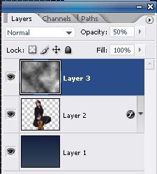
9. Select the girl’s layer from layers panel and drag it to the top, so that it would be your utmost upper layer.

Remember to remove the parts where layers turn to be on top of one another.
10. Take a photo of a lake with water circles. We used this one from Digital Free Photo, but again – this is optional.
Paste the layer unto your composition, so that the circles in the water will be “around” the girls or your main figure.

11. Using the Eraser Tool, remove the lower part of the girl’s layer, so create the illusion as if she is really sitting inside the water and the water circles are “from” her.

12. Set lake’s layer blending options to Luminosity.

13. Drag the Layers of the clouds on top of the water later and using eraser tool with soft edge (100px) remove the sharp parts, so that only the “steaming” clouds will remain, no edges.

14. Now to the hard bit – creating the plasma cycles.
Make a new layer (this is important) and place it on top of all the others.
15 Using the Elliptical Marquee tool, draw and ellipse. While the ellipse on the new layer is selected, Right-mouse-click and choose “stroke”. Apply the settlings below for the stroke effect:

16. Press Ctrl + T to free transform, and then right-mouse-click >> Prospective. Try to distort the round layer you have to it would look like the line is surrounding or flowing around the girl.

17. Using the Eraser tool with big soft edge, remove the “farther” part of the round, behind her head, like this:

18. While this layer is selected, go to Layer >> Layer styles >> Outter glow and apply the following glow settlings:

19. Duplicate the layer a several times and each time transform the round using the prospective settlings, so that the circles chaotically surround the main figure’s body.

20. Remember to leave the “front” part of the circle visible and erase the “back” part of it. This is more or less what you should have by now:

21. Flatten the Layer.
22. Go to Image >> Adjustments >> Levels and apply the following settlings to give the image an overall bluish hue:


23. Duplicate the layer.
24. While the upper layer is selected (and your background colour in the palette is set to white), go to Filter >> Distort >> Diffuse Glow and apply these glow settings.

25. Reduce the opacity of the “glowing layer” to 20% (or less, depends on your image).
26. Flatten the layer again to merge both layers into one.
27. Using some star brushes (download free on deviant Art resources page), apply the stars chaotically around and allover the glowing cycles.

28. Select the background layer (the artwork, not the stars) and to to Renters >> Lightening effect, apply the following spot light effect twice.

29. Get back to Stars layer, and go to Layer >> Layer Styles >> Outer Glow, and add the following glow using white #ffffff colour.

30. Duplicate the stars layer.
31. Go to Filter >> Blur >> Radial Blur and apply these settings.

You may choose to reduce the opacity of this layer if you feel the rounded blurred effect is too strong. That’s it, your artwork is ready:
Download my poorly cropped Render:

The requests for Fantasy Art tutorials are enormous, I still get emails and Pms from people asking to do more Fantasy Art tuts, so here is one more, called “Plasma” (Star, not the TV!) which I hope you’d enjoy.
1. Make a new canvas, we used 600*480 px here, but the size is of course optional.

2. Select the Gradient Tool, using two shades of blue (see below), fill your canvas, so that the darker colour will be on top.

3. Take a photo of a girl. Traditionally I am using Arman‘s photo from her Deviant Art account, but you can replace her with any semi-sitting figure of your choice. Crop the figure and paste her unto your canvas. In needed, resize her so that she will fit in.
4. To get rid of the visible crappy cropping, and to give the girl more emphasis, add blueish glow to her by going to Layer >> Layer Styles >> Outer Glow and applying the following settings:
This is what you would get:

5. Make a new Layer. Make sure your primarily and secondary colours are black and white. Go to Filter >> Render >> Clouds
And, if needed apply the clouds effect a several times to achieve the desired randomly “clouded” effect.

6. Reduce the opacity of the layer to semi-visible.
7. Press Ctrl+T for free transform, and then right mouse click and “Scew”. Drag the left corner of the clouds layer, as shown on the illustration below:

Press “Enter” when you are done, then Ctrl + D to deselect the layer.
8. Duplicate the clouds layer. Select the upper layer and go to Edit >> Transform >> Flip Horizontal.

9. Select the girl’s layer from layers panel and drag it to the top, so that it would be your utmost upper layer.

Remember to remove the parts where layers turn to be on top of one another.
10. Take a photo of a lake with water circles. We used this one from Digital Free Photo, but again – this is optional.
Paste the layer unto your composition, so that the circles in the water will be “around” the girls or your main figure.

11. Using the Eraser Tool, remove the lower part of the girl’s layer, so create the illusion as if she is really sitting inside the water and the water circles are “from” her.
12. Set lake’s layer blending options to Luminosity.

13. Drag the Layers of the clouds on top of the water later and using eraser tool with soft edge (100px) remove the sharp parts, so that only the “steaming” clouds will remain, no edges.

14. Now to the hard bit – creating the plasma cycles.
Make a new layer (this is important) and place it on top of all the others.
15 Using the Elliptical Marquee tool, draw and ellipse. While the ellipse on the new layer is selected, Right-mouse-click and choose “stroke”. Apply the settlings below for the stroke effect:
16. Press Ctrl + T to free transform, and then right-mouse-click >> Prospective. Try to distort the round layer you have to it would look like the line is surrounding or flowing around the girl.
17. Using the Eraser tool with big soft edge, remove the “farther” part of the round, behind her head, like this:

18. While this layer is selected, go to Layer >> Layer styles >> Outter glow and apply the following glow settlings:
19. Duplicate the layer a several times and each time transform the round using the prospective settlings, so that the circles chaotically surround the main figure’s body.
20. Remember to leave the “front” part of the circle visible and erase the “back” part of it. This is more or less what you should have by now:
21. Flatten the Layer.
22. Go to Image >> Adjustments >> Levels and apply the following settlings to give the image an overall bluish hue:
23. Duplicate the layer.
24. While the upper layer is selected (and your background colour in the palette is set to white), go to Filter >> Distort >> Diffuse Glow and apply these glow settings.
25. Reduce the opacity of the “glowing layer” to 20% (or less, depends on your image).
26. Flatten the layer again to merge both layers into one.
27. Using some star brushes (download free on deviant Art resources page), apply the stars chaotically around and allover the glowing cycles.
28. Select the background layer (the artwork, not the stars) and to to Renters >> Lightening effect, apply the following spot light effect twice.

29. Get back to Stars layer, and go to Layer >> Layer Styles >> Outer Glow, and add the following glow using white #ffffff colour.

30. Duplicate the stars layer.
31. Go to Filter >> Blur >> Radial Blur and apply these settings.

You may choose to reduce the opacity of this layer if you feel the rounded blurred effect is too strong. That’s it, your artwork is ready:
Download my poorly cropped Render:

5 Tips Menulis Ala J.K Rowling Pengarang Harry Potter

Mau bisa menulis Maha karya novel seperti Harry Potter ? baca yuk 5 hal yang bisa kita pelajari dari cara menulis J.K. Rowling:
1. Ketekunan. Rowling mendapatkan ide mengenai Harry Potter pada tahun 1990, dan menghabiskan 17 tahun untuk mengerjakannya sebelum dia menyelesaikan seri terakhir novel tersebut, Harry Potter and the Deathly Hallows, pada 2007. 17 tahun melebihi rentang waktu seorang anak dalam menempuh jenjang Taman Kanak-Kanak sampai SMU.
Tips: Kita mungkin saja memulai sebuah proyek menulis dan masanya akan tiba—hari, minggu, atau bulan—dimana kita akan merasa bosan, frustasi, bahkan ingin rasanya berteriak meninggalkan itu semua selama-lamanya. Tapi lihatlah jika kita berhasil mengatasi itu. Berpikir menyeluruh.
2. Rowling menulis biografi di websitenya bahwa dia sedang berada di dalam kereta ketika ide mengenai Harry Potter melintas di benaknya. Dia tak memiliki kertas ataupun pena, sehingga dalam 40 jam perjalanan dengan kereta itu, hal yang ia lakukan hanyalah berpikir. Rowling memaksa dirinya untuk terus merenung agar dapat menyimpan setiap detail kisah Harry Potter. “Menurutku, jika saat itu aku langsung menulisnya di kertas, aku justru akan memperlambat segala ide yang muncul.”
Tips: Jangan terlalu cepat menulis sebuah ide. Pikirkan juga mengenai struktur, konsep, kesimpulan, dan cara bercerita yang akan kita terapkan sebelum menuliskannya. (Catatan: cara ini termasuk keunikan yang dimiliki Rowling. Sebagian besar penulis justru menulis secara acak setiap idenya di mana dan kapan pun itu. Mereka sering khawatir jika saja ide itu terlupakan apabila tak segera dituliskan).
==
Sebelum lanjut baca klik like dulu Penulispro.com :: Komunitas Penulis Produktif Terbesar Indonesia untuk tips copywriting lainnya.LIKE YA !
==
3. Jika ide cerita cukup menarik, teknik menulis bisa menjadi sekunder. Rowling bukanlah penulis sekaliber Ernest Hemingway. Harry Potter dan Batu Bertuah bukan pula judul yang melegenda seperti, misalnya, di Indonesia orang banyak mengenal wiracarita Ramayana. Tulisan di novel pertamanya itu lebih mirip catatan jalan-jalan biasa. Tapi kalau kita melihat ide ceritanya, boleh jadi tak akan banyak orang yang bisa menyamainya.
Tips: Kalau kita memiliki sebuah kisah yang menarik, ceritakanlah. Orang lebih tertarik pada ide cerita terlebih dahulu, meskipun jika kita juga memiliki kemampuan menulis yang memadai, cerita itu akan lebih menarik lagi.
4. Keyakinan diri. Pada saat memulai Harry Potter, Rowling adalah single mother yang harus berjuang menafkahi diri dan anaknya. Dia tak memiliki koneksi dengan industri penerbit, juga wadah untuk melakukan itu semua.
Tips: Dibutuhkan ketekunan, gairah, dan kenekatan si kecil Harry Potter untuk membuat diri kita cukup yakin dalam menembus dunia penerbit sebagai penulis pemula. Hal ini berbeda dengan kecenderungan penulis pemula yang lain, dimana mereka justru hanya bermodal nekat dan terburu-buru menyerahkan naskah kepada penerbit seolah akan menerbitkannya di sebuah website atau blog saja. Ingat, Rowling menyelesaikan Harry Potter selama kurang lebih 17 tahun, dan selama itu pula ia mengasuh anaknya tanpa seorang suami.
5. Menulis ketika sedang bersemangat. Rowling lebih suka menulis di sepanjang malam, atau di café-café yang sepi sambil mendengarkan musik. Hal itu membuatnya tenggelam dalam imajinasi. Ketika menyelesaikan “Deathly Hallows”, dia menyewa sebuah kamar hotel sehingga dia bisa menulis akhir cerita tanpa gangguan sedikit pun.
Tips: Kita mungkin tak sanggup menyewa sebuah kamar hotel atau menulis semalaman suntuk, terlebih lagi jika memiliki kegiatan rutin di pagi hari. Tapi kita bisa menyusun jadwal sehingga nantinya akan menulis dengan energi yang optimal, kapan dan di mana pun berada.
9 Jenis Font Keren Untuk Design
Font adalah unsur yang sangat penting dalam urusan web desain ataupun desain grafis . Pada postingan kali ini, Sharing Online akan merekomendasikan 9
situs penyedia font gratis dan unik yang bisa kalian download.
1. Blambot - Font dengan tema komik bisa kalian cari disini
![[Image: blambot.jpg]](https://lh3.googleusercontent.com/blogger_img_proxy/AEn0k_vgSFlsAaULqr7legijN-a9_If4oyMbIsUrnQIm-qUG_c9j-79u8cXkfe2oHg0Ra3GU7lE46cIYkTw7pGFnDq-LTKlpNx_X5ujxLAlnRWr5zMAU8-cIe8RuEhaXbK16ek-Lm6kh=s0-d)
2. Dafont - Memiliki koleksi lebih dari 17 ribu jenis font yang dibagi dalam berbagai kategori
![[Image: dafont.jpg]](https://blogger.googleusercontent.com/img/b/R29vZ2xl/AVvXsEhyi0I3xJgzUAY4boIPOhH-mmFhMkRKLTmaCQD0erver8T5jq7_9rw9kb4AtU-kIMaPMk4YE6rWqQia_NWODd9yZd1wPIJ2ud2WZCwMIwDfn8ZL4hfO9IL77CDKCs4ttOPxxnXaMp07E4k/s400/dafont.jpg) 3. Font Squirrel - Kualitas tinggi,designer friendly,dan tentu saja gratis
3. Font Squirrel - Kualitas tinggi,designer friendly,dan tentu saja gratis
![[Image: fontsquirrel.png]](https://blogger.googleusercontent.com/img/b/R29vZ2xl/AVvXsEg3syLLoMuVqlGItzMRI3A_uVnwCgwADPRN-t7tny4UK7Ggt4qPVmbgW8AjBd8KM_vFpJdwW-z0VFqn3de4mrSH27-XEg9slbCepYOoJlYGM4o-i1wtu1vaRlJblfG77dqn8toartJTAfQ/s400/fontsquirrel.png)
4. Abstract Fonts - Lebih dari 13500 font gratis tersedia dan tiap minggu ada font-font baru.
5. Simply The Best Fonts - Disini ada juga font yang berbayar,namun yang gratis juga sangat banyak.
6. Fonts2U - Memiliki koleksi lebih dari 49000 jenis font
![[Image: fonts2u.jpg]](https://lh3.googleusercontent.com/blogger_img_proxy/AEn0k_tV_r5z0vFcX9RR54k5mXSisG9Tq1GIUkXvtgYX6-_F3JzFvIKMw3KFrDqgDVeL6eXWD0QQib73Lrlq-9nLOg35YQwfqbT-01deAMc3zMaPekXcRFjSVG6UcpAqi-xZ_zyDMZsddIvZTA=s0-d)
7. 1001 Free Fonts - Didirikan sejak 1998,dan memiliki 50 ribu pengunjung tiap harinya.
![[Image: 1001freefonts.png]](https://lh3.googleusercontent.com/blogger_img_proxy/AEn0k_tMLggdtvrQSR5QJoauKLFjjwKIabFWWCAxVqMaSu2U-GyEWIyOcj4iZ5T7b0h_qHpfN_uugHZnnNRWpmoLBhovKp7blYvrXAusHMv10zm6I4r44ZjcoCk63rGjY0s=s0-d)
8.Tack-O-Rama-Bagi penyuka style Retro disini adalah tempat yang tepat
![[Image: downloadfont_6.jpeg]](https://lh3.googleusercontent.com/blogger_img_proxy/AEn0k_sjLg4qgZtJr5QwM1Ys1L0CrkdAh0BaRyA9Mgxn52Od4_Uqj0TF-Y7NCA3ExvkF2bNskKCdH-HtsB0q0kpEu3eYFCQ9ajpe_qgD1lL2dq7Lt6K7Tb9F0MfvpdNi20Dh8ZaXvfiK0pbUeOBirBU=s0-d)
9. Urban Fonts - Dilengkapi dengan dingbats yaitu sejenis font symbol.
![[Image: downloadfont_5_1.jpeg]](https://lh3.googleusercontent.com/blogger_img_proxy/AEn0k_vuMlosogdNXCCCQoDvieX5kPPOwJJskOtsBCFtlrJDYgPEQ5H7NZmrHmIuN4i_GbwHRDuOOY6tUwLdDqppnaCknGyF1383tbee_XCi77LUHKxo0NmyUHXyL2wwKc_68aek1DbEtN6G677zz1Sz9Q=s0-d)
Semoga bermanfaat
1. Blambot - Font dengan tema komik bisa kalian cari disini
2. Dafont - Memiliki koleksi lebih dari 17 ribu jenis font yang dibagi dalam berbagai kategori
4. Abstract Fonts - Lebih dari 13500 font gratis tersedia dan tiap minggu ada font-font baru.
 |
5. Simply The Best Fonts - Disini ada juga font yang berbayar,namun yang gratis juga sangat banyak.
6. Fonts2U - Memiliki koleksi lebih dari 49000 jenis font
7. 1001 Free Fonts - Didirikan sejak 1998,dan memiliki 50 ribu pengunjung tiap harinya.
8.Tack-O-Rama-Bagi penyuka style Retro disini adalah tempat yang tepat
9. Urban Fonts - Dilengkapi dengan dingbats yaitu sejenis font symbol.
Semoga bermanfaat
Langganan:
Komentar (Atom)